Advanced Typography - Task 3: Type Exploration and Application
Chan Wan Qing / 0350928 / BA of Design (HONS) in Creative Media
Typography
Task 3
INDEX:
1.
Task 3: Type Exploration and Application
2.
Feedbacks
3.
Reflection
4.
Further Readings
LECTURES
Completed in Advanced Typography - Task 1
INSTRUCTIONS
Task 3: Type Exploration and Application
For this task, we can dictate our own project. We are to determine one direction to head in from the 3 options:
1) Create a font to solve a larger problem or meant to be part of a solution
in an area of interest;
2) Explore the use of an existing letterform in
an area of interest, improve upon and explore possible solutions;
3)
Experiment. Identify potential weaknesses or possible areas of further
exploration or experimentation in an area of interest, and provide a creative
solution or add value to an existing use by working with materials.
The end result of this task should be a complete generated font (.ttf) with applications.
1. Idea Proposal
At the start of the semester, we are already introduced briefly about this assignment, so I already had a brief idea on what am I going to do. So in week 7, I started to write about the idea proposal. I chose the first option, where I identified a problem and create a font that can solve it like what is shown in [Fig.1.1].
Mr Vinod approved this idea and suggested me to choose a country to work on, such as Harimau Malaya. So, I searched for the current font used by the Malaysia football team. The letter '7' looks very much like the question mark, '?'. From here, Mr Vinod suggested that I can use this as the basis of creating the whole typeface. I also looked into the fonts used by Harimau Malaya throughout these years.

From what I had researched, I observed that most of the typefaces on the jerseys did not have small letters, probably because most of them only use capital letters to print their names on the jerseys so that they are more larger and more readable.
https://www.linkedin.com/pulse/football-typography-evolution-marc-feixas
http://www.madebyberry.com/project/a-typography-book-about-the-football-world-cup/
I also did some research on the other typefaces of some other football teams to observe their shapes, strokes and so on.

2. Sketches
I did some rough sketches for jersey font on week 8. For the first sketch, I sketched the letterforms based on a shape. The strokes are not consistent as I only sketch it without following x-heights, cap heights and so on.

For the second sketch, I used grids to create the letters, I only did a few letters to see the results. I created 3 grids and sketch the letters based on all the grids.

Based on grid 2, I created the third grid. I think it looks better and cleaner compared to [Fig.1.5].

Fig.1.6 Sketch 3 - Grid 3 (18.10.2023 - Week 8)
3. Digitisation ('A', 'H', 'O', 'N')

Fig.1.7 Digitisation 'A', 'H', 'O', 'N' - 1 (25.10.2023 - Week 9)
After that, from the feedbacks I have received on week 9, I added some elements that can represent 'Harimau Malaya' such as the sharp end or the stripes. I tried using both elements for the letters so that I could compare them. For the characteristics of sharp end, I used the sharp tooth of tiger (Harimau) as the reference and added it to the ending parts of letterforms. I created to style of 'A' to compare them.

Whereas for the stripes, I searched for tiger stripes and pasted them into the strokes of the letterforms mainly for vertical strokes as it will be too much and looks messy if they are added into every strokes. I extracted one of the stripes as the horizontal stripes of 'A' and 'H'; and for the left stroke of the letter 'A' to make them looks more like a tiger stripes, I also extracted one of the stripe straightly and used it as a slightly slanted left stroke of the 'A'. I also created to style of 'A' to compare them.

I liked the second style more and I showed it to Mr Vinod. Mr Vinod said they are interesting and so, I continued to create the whole set of letterforms using this style. While creating the letterforms above, I already created the strokes from the shapes and blocks, so I can duplicate the blocks and create the other letterforms.

Fig.1.10 Process from Sketch to Digitisation with Styles (25.10.2023 - Week 9)
4. Digitisation (Whole Set of Letterforms)Uppercase
After creating the style, I started to create the letterforms with guidelines on an artboard with 1000px height and 500px cap height. I started creating capital letters with the basic shapes after I enlarged them into the cap height.
.png)
With the basic shapes, I duplicated them and joined them following the letterforms. I also looked back into the grid I created in my sketch for some of the letters if I was not sure how the letters will look.
Fig.1.12 Digitisation 1 (Uppercase) (25.10.2023 - Week 9)
![]()
.png)
Fig.1.13 Digitisation 1 (Uppercase) - Outline (25.10.2023 - Week 9)
I completed the first digitisation of capital letters. However, I found that some letters are a bit odd and strange, where they did not look like the same group. For example, the letters 'K', 'V', 'X' , the diagonal strokes look more thinner compared to the vertical strokes; the diagonal strokes of letters 'Q' and 'R' also look too long. I also struggled while creating the letter 'Z'.'
Then, I proceeded to make some improvements on some of the letters. I rounded the inner part of some letters like 'C', 'G', 'Q' and more.
![]()
![]()
Fig.1.15 Digitisation 2 (Uppercase) - Outline (25.10.2023 - Week 9)
I also remake another style of 'A', but I am not sure which is better and more suitable. For me, I like the 'A' in digitisation 1 better, however, when thinking about the main purpose of these set of letterforms, which very much emphasize on readability, I think the 'A' in digitisation 2 is more suitable.


Fig.1.16 Comparison of 'A' in Digitisation 1 (Left) and Digitisation
2 (Right) (25.10.2023 - Week 9)

Fig.1.17 Refinements of 'K', 'U', 'X', 'Y' and 'U' (25.10.2023 - Week
9)
![]()
![]()
Fig.1.18 Refinement Using Grids (25.10.2023 - Week 9)


After refining within the grids, I extracted the letters out and see the overall outcome.
I refined the letters again for some details because I found that the triangle shape in the diagonal strokes are not consistent for every letters.
In week 10, from the feedback I had received from Mr Vinod, I decided to refine the letter 'Y' to make the arm lower.

Final Uppercase
Lowercase
![]()
![]()
.png)
Fig.1.28 Digitisation 1 (Lowercase) - Outline (25.10.2023 - Week 9)
Initially, while creating the lowercase letterforms I did not follow the grids, so I found that the width of the letters are difficult to adjust. Some of the letters, like 'b', 'g', 'q', 'y' and so on, the space is a little bit too wide. And similar to the problem in digitisation 1 of capital letters, the diagonal stroke of 'v', 'w' and 'x' is a little bit thin and the width is not consistent also. Therefore, I created another digitisation of the small letters using grids and refined some letters. The width of the small letters takes up 3 and a half column.
Fig.1.29 Refinement of Some Letters (25.10.2023 - Week 9)
I also refined the letter 'z' following the capital letter of 'Z'.
.png)
Fig.1.31 Refinement of 'z' (25.10.2023 - Week 9)
After refining the letters within the grids, I extracted the letters out and see the overall outcome.
Fig.1.32 Digitisation 2 (Lowercase) (25.10.2023 - Week 9)
I refined the letters again for some details because I found that the triangle shape in the diagonal strokes are not consistent for every letters, so I removed the spaces.
Final Lowercase
In week 10, Mr Vinod urged us to create the capital letters and small letters side by side, so that we are able to maintain the consistency of the strokes. So, I put my capital letters and small letters together and observed that is them ok or not.
Fig.1.35 Capital Letters and Small Letters (1.11.2023 - Week 10)
Numbers
While creating the numbers, I referred to the typeface, Nippo on Fontshare, which I think is more similar to my letterforms. I observed the height for numbers, which followed the cap height, as this is the first time I create the numbers.

After that, I started to create the numbers using the strokes from capital letters. To differentiate the numbers and capital letters, I made the numbers more geometric, which have a sharper characteristics compared to letterforms.
![]()
Fig.1.38 Digitisation 1 (Numbers) - Outline (25.10.2023 - Week 9)
Then, I followed the grids while making the numbers, same with the capital letters, the width of numbers takes up 4 columns.
I refined the '4' because the horizontal stroke seems a little bit thick.


Fig.1.41 Digitisation 3 (Numbers) - Outline (25.10.2023 - Week 9)
Fig.1.42 Digitisation 3 (Numbers) - Grids (25.10.2023 - Week 9)
![]()
Fig.1.43 Digitisation 3 (Numbers) (25.10.2023 - Week 9)
Final Numbers
Punctuations
We need to create 10 punctuations for this task. I used the basic shapes in capital letters to create the punctuations. I did researches on FontShare to observe the punctuations. The ? and ! are in between the baseline and cap height; the ' ' and " " are placed above the cap height, so I reckon they are on the ascender; the [ ] and { } and ( ) are also in between the ascender height and descender height.
.png)
.png)
.png)
After doing research, I started to create the punctuations using the basic shapes in capital letters.

![]()
Fig.1.47 Punctuations (1.11.2023 - Week 10)
4. FontForge
After finishing the letterforms and numbers, I started the step of generating the font. Initially, I used FontLab, but it is the demo version, and I couldn't save or export the file, so I redo it in FontForge. First, I watched the tutorial video in the YouTube AdTypo Playlist, and I followed the steps, exported the letterforms into assets in Adobe Illustrator, and then exported them as SVG file to my files.
.png)
Then, I imported the assets into FontForge. However, in the first attempt, the size of the letterforms are scaled according to the default size, and the uppercase and lowercase appear to be the same height.
.png)
Eventually, I realised that I need to turn off "Scale to Fit" while importing the letterforms. And finally, I imported all the letterforms from Illustrator to FontForge.
.png)
But, I faced difficulties in individual kerning in FontForge as I could only adjust the left bearing and right bearing of each individual letterforms. It looks okay if they are only uppercase and lowercase, but if I insert numbers and letterforms together, the gap will be bigger than usual.
.png)
I figured out the way to do kerning in FontForge. So, I did individual kerning for the letterforms, the process is much more difficult and complicated than kerning in FontLab. In FontForge, I need to type out the letters one by one in each column to do the kerning.
.png)
Then, I realised that I can kern the letters individually from the metrics window. I chose the sub-table I had created at the top of the right, and started to type out the letters and do individually kerning.
.png)
After completing individual kerning for all letters, I generated the font and proceed to font presentation.
5. Font Style
While creating the font presentation, I had an idea of creating italic version of the font. Therefore, in FontForge, I made a italic version where it will automatically creates slanted letterforms.
.png)
Fig.1.54 Font Style - Italic (15.11.2023 - Week 12)
6. Font Presentation
The second part of this task is font presentation and font application. Before starting on font presentation, I reviewed the files provided by Mr Vinod that gave us ideas on font presentation. I also found some inspiration and references online about font presentation.


1st Attempt
I decided to use the theme of tiger from 'Harimau Malaya' in my font presentation. I searched for some visual elements that related to my font, which is also derived from the characteristics of tiger. I used the stripes of tiger and the logo of Harimau Malaya in my font presentation. For colour scheme, I used the official colours hues of Harimau Malaya, yellow and black to present the font. I fixed the width in 1024 px.


Based on the feedbacks from Mr Vinod, the 1st attempt of presentation is too yellowish, and the font does not stand out. So, in the second attempt, I did not add other colours in the font presentation and focus on presenting the font.
2nd Attempt
I began with the name of the Malaysia's National Football Team and slowly expanded to other letters, styles and numbers. I presented the font in different font size, font styles, and also control the transparency on some text.


Fig.1.57 Font Presentation Attempt 2 - Numbers and Italic Letters (15.11.2023 - Week 12)
During the process, I also added quote in the presentation of font.


Fig.1.59 Font Presentation Attempt 2 - Font Sizes (15.11.2023 - Week
12)

Fig.1.60 Font Presentation Attempt 2 - Jersey (15.11.2023 - Week 12)

Fig.1.61 Font Presentation Attempt 2 - Substitution Board (15.11.2023
- Week 12)


Fig.1.63 Font Presentation Attempt 2 - Additional Ideas (15.11.2023 -
Week 12)
I also added some simple colours on some of the font presentations. We need 4-5 font presentations only, so I chose 4 from above.
Final Font Presentation

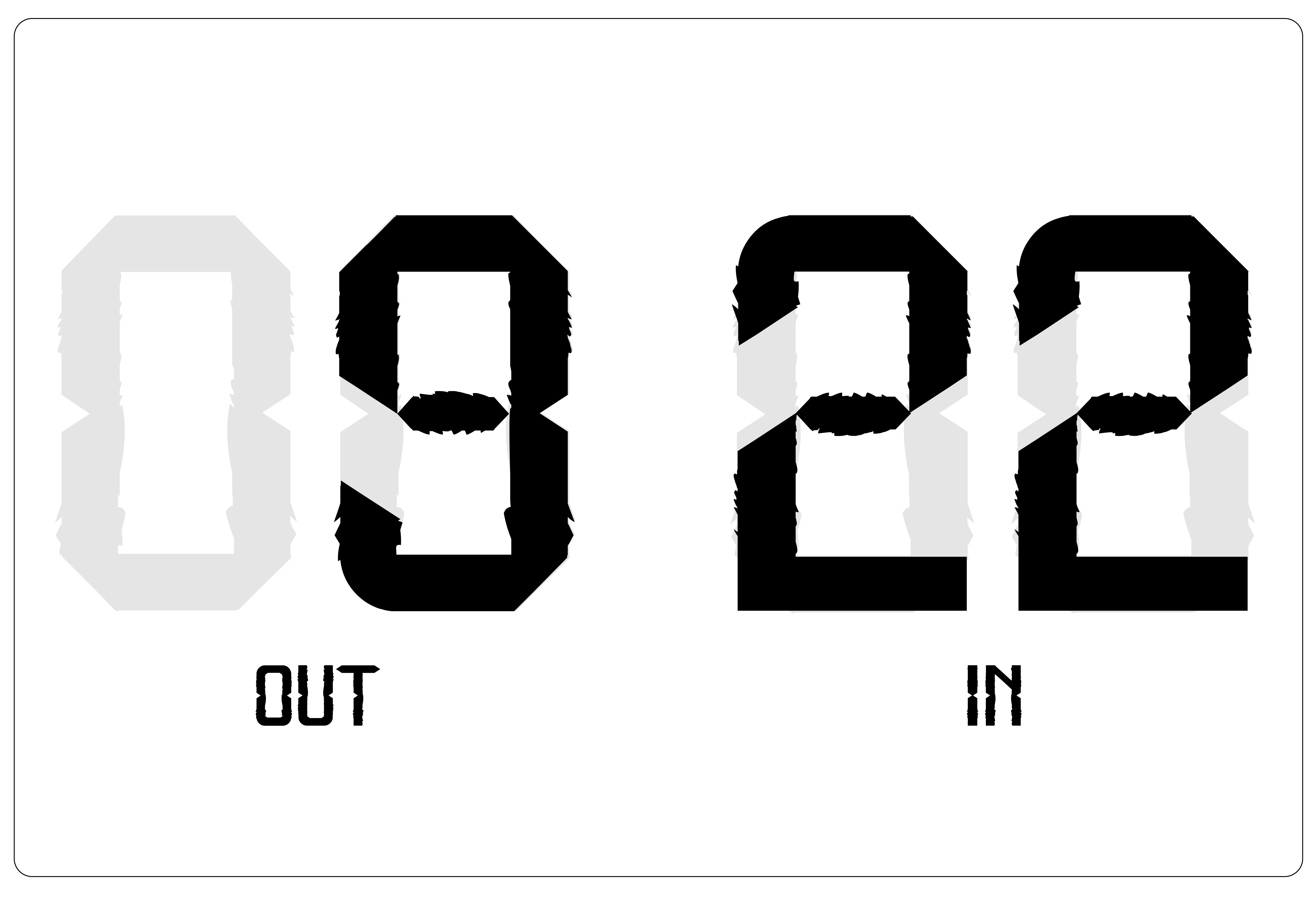


In the next part, we are required to do the font application part. This is a font that mainly applies in football as my initial idea is to create a typeface for Malaysia Football team (Harimau Malaya) that is unique and readable at the same time.
Therefore, the colour palette of this font application will be focus on yellow and black colours. The ideas for the font application is to apply the font into jerseys, tracks, L.E.D board and other items, such as merchandise, or places, such TV screen, that can be seen or used in football.
1st Attempt
Fig.1.65 Font Application - Jersey (15.11.2023 - Week 12)

Fig.1.66 Font Application - LED Screen 1 (15.11.2023 - Week 12)

Fig.1.67 Font Application - LED Screen 2 (15.11.2023 - Week 12)

Fig.1.68 Font Application - Mafla (15.11.2023 - Week 12)

Fig.1.69 Font Application - Coach's Tracks (15.11.2023 - Week 12)

2nd Attempt
Based on the feedback I have received on week 13, I made a 2nd attempt on the application of mafla and coach's track.


Fig.1.73 Font Application - Jerseys 1 (22.11.2023 - Week 13)

Final Font Application


Fig.1.75 Final Font Application (22.11.2023 - Week 13)
Downloadable font link: Ultras.ttf ; Ultras-Italic.ttf
Fig.1.77 Final Font Presentation 1 (29.11.2023 - Week 14)
Fig.1.78 Final Font Presentation 2 (29.11.2023 - Week 14)
Fig.1.79 Final Font Presentation 3 (29.11.2023 - Week 14)
Fig.1.80 Final Font Presentation 4 (29.11.2023 - Week 14)
Fig.1.81 Final Font Application - Mafla (29.11.2023 - Week 14)

Fig.1.82 Final Font Application - Jerseys (29.11.2023 - Week 14)


Fig.1.84 Final Font Application - LED Screen (29.11.2023 - Week 14)
FEEDBACKS
Week 8 / Task 3
Independent Learning Week
Week 9 / Task 3
General Feedbacks:
Record all the process while designing the typeface, replicate them if we need to make changes so that we can prove that we designed it. While designing the letterforms, design letters 'H', 'O', 'A', 'N' first as from the strokes of these letters, we can use them to construct the other letters.
Specific Feedbacks:
I can proceed with my idea. Mr Vinod suggested me to design the jersey font for Malaysia Football Team, Harimau Malaya. I need to look into the characteristics of the team, and add the elements which can represent the team while designing the typeface. For example, add a sharp end to the letters make it like the strips of a tiger, or add the furry elements like the fur of a tiger. Also, I should look into the current font of Harimau Malaya, where the '7' looks like a '?', this can be the basis of designing the jersey typeface for Harimau Malaya.
Week 10 / Task 3
General Feedbacks:
Put uppercase and lowercase together, next to each other while creating the letterforms to maintain consistency.
Specific Feedbacks:
The letterforms look consistent, it's up to me if I want to refine the letterforms if it looks weird to me, overall, Mr Vinod thinks it's consistent, the arm of 'Y' seems a little bit short, it's also up to me whether to have a gap on the 'K'. Can proceed to generate the font and then applications.
Week 11 / Task 3
Specific Feedbacks:
After completed the kerning of the letters, can generate the typeface and start to plan the font presentation.
Week 12 / Task 3
Specific Feedbacks:
Should focus on presenting the font on black and off white first, don't focus to much on the colours and texture first, for the first attempt, there is a lot of yellow. Find the name of the players from the national team with their numbers so that I can include them in the presentation. Remember to leave margin for the presentation. Can also add simple graphic elements in font presentation. Ideas for font application: Substitution digital board, LED board shown in stadium, jerseys for coach (with their initials) and players.
Week 13 / Task 3
General Feedbacks:
The font need to be seen in font presentation.
Specific Feedbacks:
Keep the font presentation of substitution board black and white because it seems a little bit weird since it is not an actual board. Can include more scarfs into the application as it looks very strict, also for the tracks, can zoom-in into one area or take picture of the black cloth and place the FAM logo, initials on it.
Week 14 / Task 3 + Final Compilation & Reflection
General Feedbacks:
Complete the submission for task 3 and final compilation & reflection in class. Start to think about the final project before even starting the final project. Look at your strength and what you've done to determine the final project. The process we learned in this module is a very important step for us to carry forward, and apply. Read news and keep updating ourselves. BE HUNGRY, OPPORTUNISTIC AND AMBITIOUS!
Specific Feedbacks:
Can add font preview into the blog. Can include 1 more previous font application 'MALAYSIA 10' for jerseys and add 1 with my own name. Change the background colour of font preview to yellow.
REFLECTION
Experiences
I felt very excited for this task from the start after I had decided on the area I wanted. As we can design a typeface for what we are interested in, I felt more energetic and excited to do research on this topic. During the designing process, I tried to go into different direction to create the style of the letters based on the characteristics of the team I am designing for. Each letter, curve, and line required a careful balance between creativity and readability. While designing a typeface, it is important to pay attention to the details and consistency. As I kept looking at the letters, I always felt unsatisfied and wanted to refine them. Moving on to generating the font, individual kerning requires a lot of time than I thought, but as we know, no pain no gain. This project has not only allowed me to explore the intersection of my passion and design but also deepened my appreciation for the transformative power of typography in conveying a subject. As I reflect on the whole journey of designing a typeface from sketches to font presentation and font application, I felt very proud of the outcome.
Observations
From the research I have done for this task, I observed that most of the font in football do not consist of lowercase where I have never noticed this before. While designing the letters, I also observed that to create letters with slanted stroke is very challenging because they don’t look consistent compared to the vertical and horizontal stroke especially because of their weight. I spent more time to amend and refine letters like ‘X’, ‘Y’, ‘Z’ and ‘K’ due to my unsatisfaction on the slanted stroke. I also observed that it is important to create the letterforms based on the grid to gain consistency on both uppercase and lowercase as initially, I created the lowercase without the grid and they look terrible due to different width of the letters, where letters like ‘b’, ‘p’, ‘q’ are wider than the other letters.
Findings
From this task, I found that it is important to do research before going into designing the typeface. In this task, I found a problem in the typeface so I design a new typeface to solve the problem, it is difficult if we do not have a purpose while designing a typeface. Designing a typeface based on a purpose had pushed the boundaries of my design skills, which in this task, it demands a thoughtful consideration of form and function. I also found that font presentation is a very useful way to allow me to reflect on the font that I designed to see, observe and find the mistakes, imperfections and refine them. I found that through font application, I was able see if the font can solve the problem that I suggested in the idea proposal.
FURTHER READINGS
.png)
Fig.4.1 Typography, Referenced (2012)
Typography, Referenced is the ultimate source of typographic information and inspiration, documenting and chronicling the full scope of essential typographic knowledge and design from the beginnings of moveable type to the present "golden age" of typography.
The contents of this book are divided into 12 chapters, including type history and timeline, type design and development, type classification and identification, type designers, type foundries and more. I think this book is very related to what we are learning in this module and it can provide us more extra information about typography.
Chapter 6: Typefaces and Specimens
In the field of typography, typefaces and type specimens are fundamental components that enable designers and communicators to select and use text effectively. Type specimens, in the context of typography, are documents or displays that showcase and provide information about a particular typeface. These specimens are created by type foundries or designers to demonstrate the features, variations, and potential uses of a typeface. They serve as a reference for designers and typographers, helping them choose the most suitable typeface for a specific project.
When it comes to selecting a typeface, a designer must consider many factors, but one tool continues to be helpful: a specification sheet, an example of every letter, symbol, and number in a typeface shown in different sizes and contexts. Type specimens have long enabled printers and designers to see an entire character set in a range of sizes.


Fig.4.3 Specimen Sheet - Example 2
Serif
Many typefaces commonly used in print today are revivals of classics created centuries ago such as Bembo, Baskerville, and Garamond.

Fig.4.4 Printing in Serif

Fig.4.5 Type Specimen (Serif) - Sabon
Sans Serif's angular appearance was met with skepticism. It quickly became known as grotesque in Europe, gothic in the United States, and finally sans syrruph in 1832 by English typographer Vincent Figgins. Most designers were focused on function instead of decoration during the 1920s.


Fig.4.7 Type Specimen (Sans Serif) - Kabel

Fig.4.8 Building Facade in Slab Serif

Blackletter
Blackletter has existed as a typographic style for centuries. It is a hybrid of both Carolingian and Old English writing, bearing resemblance to ancient scribes’ handcrafted writing from ninth-century Italy and France, and as far east as Germany. Today, it appears in newspapers, on beer labels, and in religious scriptures, connoting a sense of reverence, reliability, and timelessness.


Fig.4.11 Type Specimen (Blackletter) - Clairvaux
Scripts can be elegant in one font, funky in another. As with handwriting, they have a wide range of styles, weights, and widths, making them one of the more varied typographic categories. Today’s hand-lettering revival has turned more attention to scripts, especially when it comes to custom lettering, prompting many designers to leave behind the computer in favor of the brush or pen.


Fig.4.13 Type Specimens (Scripts) - Bickham & Choc


Comments
Post a Comment