Advanced Typography - Task 2: Key Artwork & Collateral
Chan Wan Qing / 0350928 / BA of Design (HONS) in Creative Media
Typography
Task 2
INDEX:
1.
Task 2
2A: Key Artwork
2B: Collateral
2.
Feedbacks
3.
Reflection
4.
Further Readings
LECTURES
Completed in Advanced Typography - Task 1
INSTRUCTIONS
Task 2A: Key Artwork
In this task, we are going to make a key artwork. It is a wordmark or lettering, but is also an artwork. We are required to use our first name or pseudonym for this exercise. We need to explore and compose as many permutations and combinations of our name in the form of a wordmark/lettering. The final key artwork should be in black and white and it must be elegant, well-balanced, and composed, avoiding complexity and confusion to ensure functionality and effective communication.
1. Research and Mood Board + Sketches
First, I did some research on key artwork on Pinterest. I also made a mind-map about myself before starting to sketch out the ideas. I then listed out some ideas from the mind-map that can represent me and sketch out the ideas

1. Criminal & mystery: I like to read suspense books or watch crime &
mystery dramas
2. Monogram: Usually used as signature in paintings which
I would like to create one to represent my paintings
3. Chinese stamp: I
like the form, it is very clean and organised, which also represents my
personalities.
4. Nouveau art: a compelling and energetic style,
representing what person I want to become
5. Repetitive: Represents my
daily life, similar but different plans everyday
Besides, I also have some ideas in my mind to create my key artwork including using my last name in English to create my last name in Chinese character. I also had an idea to include braille alphabet in one of my sketch because I was trying to learn braille alphabets.

I have many ideas with different directions that can represent me. I am going to shortlisted the sketches before starting the digitisation process.
Shortlisted Sketches:
Skecth #1
For this sketch, the concept is using my English last name to form my Chinese last name (QINg - 晴). This sketch consists of straight lines and curved lines, the straight lines represent firmness, and the curved lines represent indecisive, which represents me also because sometimes I can be very firm on my decisions, but sometimes I might be indecisive.

Sketch 2
For this sketch, I was inspired by nouveau typography style. Nouveau art style carries the meaning of energetic and compelling, this represent what person I wish to become.

Sketch 3
Inspired by Chinese stamp, reason being that is because it is very clean and organised. I'm more likely a highly-organised person compared to being spontaneous.

Sketch 4
The concept of this sketch is handwriting. One's handwriting can reflect a person's personalities. It is light pressure (the sketch looks a little bit heavy pressure since I used digital sketch), which means I'm an adaptive, I can move easily from one place to another. It is a little bit right slanted, which represents that I am a sentimental person. The connecting stroke of q and g looks like a W, which is also my name, W(an) qing.

Week 4 In-class Activity
In week 4's class, Mr Vinod asked us to create a wordmark that we will print it on a t-shirt without thinking the meaning of it. I made 2 versions. Mr Vinod said that the 'ng' of the second one is interesting, and the 'Qi' looks like a search bar. Initially, I also did not think of the search bar, but now I can't unsee it!

2. Digitisation and Explorations
Digitisation #1 (Sketch #1)\
For the digitisation of the first sketch, I used shapes to create the letter 'Q'; the letters 'I' and 'N' are text, with the typeface named 'Lucida Fax'; whereas for the letter 'g', I used pencil tool as I wanted to connect it with letter 'Q' and 'I','N'. Then, I used width tool and curvature tool to amend the thickness and shape of the letter 'g'. I also bolded the letters 'I' and 'N' at the end as I feel like the strokes are too thin.


I also explore another concept for this idea, which I apply different typefaces I found on Pinterest into this idea, however, I think it does not work since it's too different from my idea, and also it is not readable, so I give up on this exploration.

Digitisation #2 (Sketch #2)
For sketch 2, I digitised the wordmark following the sketch. However, I feel like it does not look like the style I wanted, which is nouveau art style. It looks like a car on the lower part of 'I' for me, which does not represent me in anywhere.

So, I went back to the previous step, and explore more about nouveau style typography. I'm influenced by the logos of letters I found on Pinterest which looks more closer to what I am looking. I amended the shapes of those logo and make the letters connected to each others. I think this one can represent me more, where I wished I can be more compelling, compared to [Fig1.12].


Digitisation #3 (Sketch #3)
For digitisation of sketch 3, I used shapes to create the letters, as this sketch has the idea of Chinese stamp and it carries the meaning of being systematic, I place the letters within the same width to make it looks organised, and the letters are read from top to bottom. However, I do think it is a little bit boring in terms of the design.
Then, I explored another design from [Fig.1.7 W4 In-class Activity]. It also has the meaning of I am systematic like the straight strokes. In [Fig.1.17], I replaced the 'i' with a upside-down '!', which could sometimes I don't want to follow any plans so I prefer to act differently.


Digitisation #4 (Sketch #4)
In the fourth digitisation, I found the typeface that is most similar to my writings, both are light pressured, and slightly right slanted. I created outline from the text and connected the letters 'q' and 'g' to form a 'W'. At the end [Fig.1.20], I connected the letters with each other.


Shortlisted Wordmarks


For the first one, although I like the design, but it is a little bit hard to read and think it as 'QINg' as the 'I' and 'N' are rotated 90 degrees. For the second one, I think it looks more trendy and it is easier to read compared to the first one. I think the third and the fourth one look more common compared to the first and second one.
In week 5, we printed out our wordmark on A4 paper and show Mr Vinod. I chose the second wordmark as my final one. On the A4 paper, we placed a bigger version of the wordmark on a square, a smaller one within the square of 15 mm x 15 mm and also another version of wordmark on a black shirt.

Mr Vinod suggested me to make the line thicker because when the wordmark is small, the lines cannot be seen. Besides, the 'I' looks more like a 'J', maybe because of the curve or the line. So, I proceeded to refine the letter 'I' and the lines. During the process of refinement, I observed carefully if the lines are aligned because when zoomed out they are easily missed. I thickened the lines from 1 pt to 4 pt or 6 pt. Since the 'I' looks like 'J' because of the curve on the baseline that seems connected to the circle, I flip the shape horizontally.

Fig.1.23 Aligning the Lines and Shapes (27.9.2023 - Week 5)

Fig.1.24 Wordmark Refinement #1 (27.9.2023 - Week 5)
After refining the first one, I tried another option to make the shape of the 'I' to a rectangle that connected to the lines with rounded edges.

After I showed Mr Vinod, he wanted me to go out and asked people if they can read my wordmark (do not ask in the class!). The result is the readability of [Fig.1.24] is higher than [Fig.1.25] because of the 'I'.
.png)
Fig.1.26 Refinement Process (27.9.2023 - Week 5)
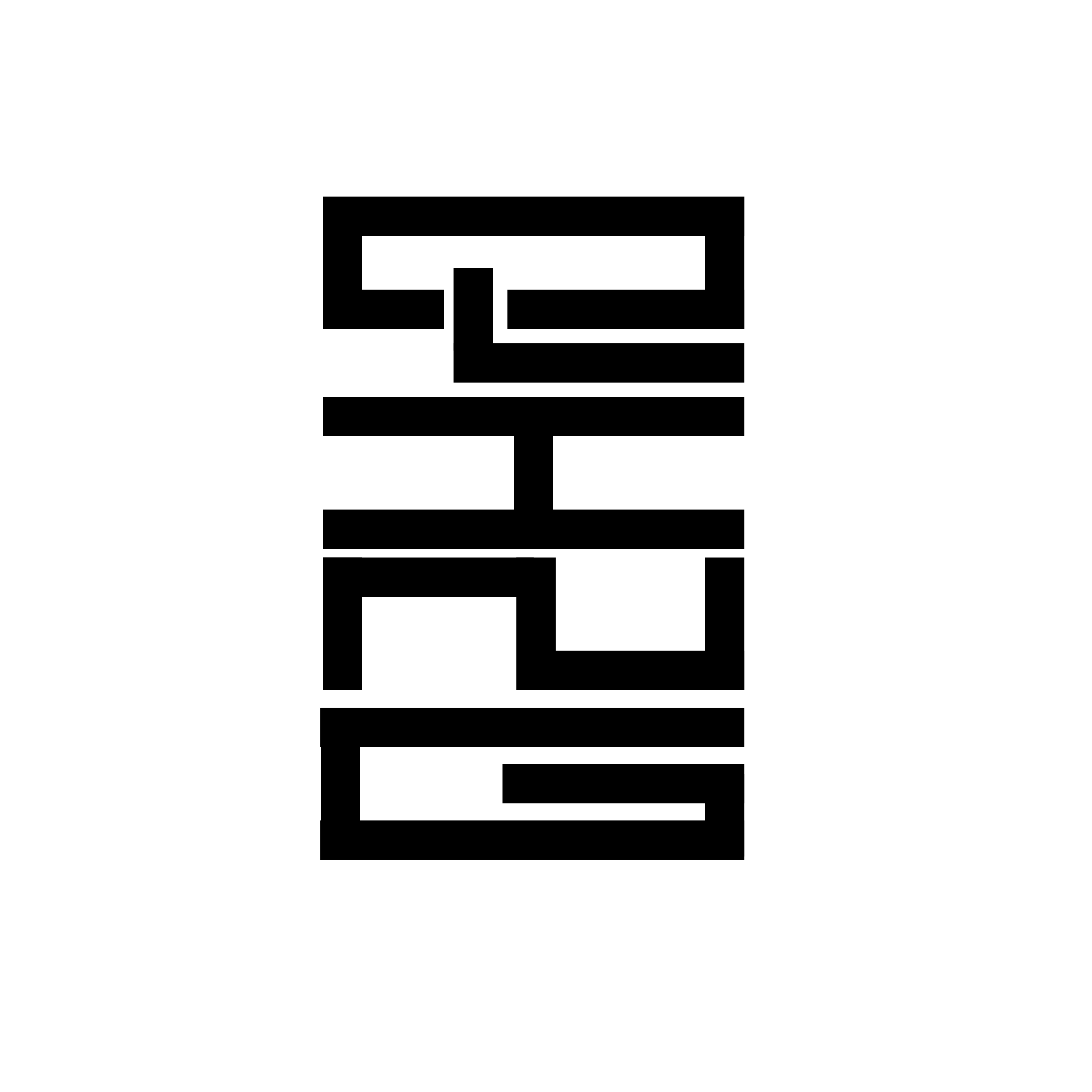
Final Key Artwork

Fig.1.27 Final Key Artwork (27.9.2023 - Week 5)
In task 2B, which is a continuous task from Task 2A, we first need to pick a colour palette for your brand's identity on the colour hunt site. We have to take a picture of a self-portrait in black and white and also identify 3 collaterals.
1. Inspirations / Research
First of all, I went to Pentagram and do research on brand identity. This allows me to be more clearer on what I need to do. I also search for some inspirations on Pinterest about brand identity which also include portraits for the brand.
https://www.pentagram.com/work/sapora?rel=discipline&rel-id=1
https://www.pentagram.com/work/quarto?rel=discipline&rel-id=1


2. Brand Identity - Key Artwork
I first choose a colour palette from Color Hunt for my brand. There are 4 colours in the colour palette that I have chosen. I chose these colours because according to my key artwork, I wanted to be more energetic and compelling, I think by creating contrast of these colours, it will have the effect of energetic and compelling.

Then, I started to use this colours on my key artwork that showcasing my brand identity. I started by using these colours on the background, and also in my key artwork. I tried 2 ways to showcase my brand, which are using the whole wordmark 'QING' and also only the letter 'Q' to represent the brand. Personally, I like exploration 3 [Fig.1.32] the most because there is contrast on the colours and it is simple and clean.


Fig.1.31 Brand Identity - Key Artwork Explorations 2 (27.9.2023 - Week 5)


Fig.1.32 Brand Identity - Key Artwork Explorations 3 (27.9.2023 - Week 5)


3. Brand Identity - Self-portrait
I used a self portrait of myself and edited it into black and white for this part. Then I added a colour layer of my colour palette and multiply it like what we did in the movie poster in task 1. Then, I used added the key artwork onto my self-portrait, trying with different sizes, placement and opacity.


4. Collaterals
I found some mockups of collaterals from Pinterest including t-shirt, paper bag, badge, tote bag, cup and tag. Then, I edited the logo of 'Q' into the collaterals.


Fig.1.35 Collateral - Badge (27.9.2023 - Week 5)


Fig.1.36 Collateral - Cup (27.9.2023 - Week 5)


5. Refinement of Brand Identity - Key Artwork
After receiving feedbacks from Mr Vinod, I changed the colours of my key artwork into a stronger colours and revised the colours between background and the wordmark. I used the dot extracted from 'G' because I wanted to keep it simple.


Fig.1.41 Refined Brand Identity - Key Artwork (4.10.2023 - Week 6)
I also tried to explore different patterns that are extracted from the key artwork, but I decided to put the patterns into the collaterals.


6. Refinement of Brand Identity - Collaterals
As my collaterals of the key artwork on my first attempt can be one of the expansion, so I chose another 2 collaterals to work on and expand them with different styles. I extracted some elements like circles, lines and so on from my key artwork and form different patterns.


Fig.1.46 Refined Collateral - Tote Bag (4.10.2023 - Week 6)
.png)
After that, we need to create an Instagram account to showcase our brand identity, we created the Instagram account in week 6's class and arrange the contents in Illustrator first before we uploaded them into the account. Mr Vinod suggested us that we can add a quote in this section while creating the contents.
.png)


Fig.1.49 Instagram Profile Attempt 1 (4.10.2023 - Week 6)
I think the first attempt looks a little bit messy for me because there are too many colours and patterns, so I tried another attempt. The second attempt looks more clean in my opinions.

After receiving feedback on week 7, I improved the repetitive parts on the second row and split the wordmark into half.

8. Animation
Lastly, we need to make a simple animation to represent our brand identity, around 2-3 seconds. I imported my key artwork from Illustrator to After Effects and make a simple animation. I am not sure how animate the key artwork as I have no ideas for it. I attempted to animate the tail of the 'Q', I want to keep it simple, but I feel like it is a little bit weird.
So, I tried to find some inspirations on YouTube and see if there is any other ideas. I also looked back at the meaning of the wordmark, which is compelling and energetic. And I came out with another ideas, which is to show the wordmark by changes of colours according to my colour palette. I like this one more as it can showcase the identity of a brand more clearer compared to the first attempt.

I tried one more attempt, developed from the second attempt, I added a little animation of the letter 'Q' slide in from the side, I animated the 'Q' because I think 'Q' is the main character of my key artwork.
Fig.1.54 Animation Attempt 3 (4.10.2023 - Week 6)
I amended the front part of the 'Q' sliding in with the dots appearing one by one using Adobe Illustrator and Adobe Photoshop like what advised by Mr Vinod.

Final Task 2: Key Artwork & Collateral

Fig.1.56 Key Artwork - Black & White (11.10.2023 - Week 7)


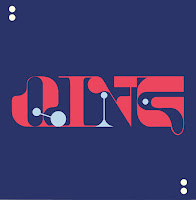
Fig.1.58 Key Artwork - Coloured (11.10.2023 - Week 7)


Fig.1.60 Instagram Screengrab (11.10.2023 - Week 7)
Fig.1.61 Animation (11.10.2023 - Week 7)
FEEDBACKS
Week 4 / Task 2A
General Feedback:
We need to have a good explanation and meaning for our design, it is important for us to present our work with convincing explanation. Sometimes, a company's wordmark can be aspirational, sometimes it can be simple. Communicable design is important, take notes on readability. Meaning has to work first, then only comes forms. Forms must follow functions. Most of the times, we start with form, but we have to think what the forms expressed and justified the forms. We should only think the key artwork as black and white only at this stage. Symmetry and balance play a big role in wordmark.
Week 5 / Task 2A
Specific Feedbacks:The "I" looks more like a "J". The lines have to be thicker because when the size of the wordmark is small, the lines disappear.
General Feedbacks:
Specific Feedbacks:
Week 7 / Task 2B
General Feedbacks:
Include the animation in Instagram. Learn how to present yourself for self-portrait as a designer. Can make the timeline more interesting by zooming in one part of the collateral, but not revealing it all in once.
Specific Feedbacks:
There is a little bit repetitive in the second row, which can be improved as there are two posts with same content. The picture can be more presentive because we can't really see the self-portrait. The collaterals are good, the identity is quite tight, the 'DARE TO DO' posts show are good with different colours. The overall timeline looks clean. The animation looks sophisticated but the front part is kind of off, maybe make the elements like dot appear slowly instead of the 'Q' sliding in.
REFLECTION
Experiences
Observations
Findings
I found that one of the most important areas we should take note while creating a key artwork is the readability of the wordmark, it should be readable so that people can recognise the brand name. Each decision while creating a wordmark had to align with the brand's personality and objectives. We had to consider how the visual identity would adapt to various mediums, from print materials to digital platforms. I also found that repeatedly used of an expansion of the wordmark will reduce the power of the expansion of the wordmark. This exercise underscored the importance of design in conveying a brand's story and values while offering opportunities for personal and professional growth.
FURTHER READINGS
.png)
Fig.4.1 Typography, Referenced (2012)
Typography, Referenced is the ultimate source of typographic information and inspiration, documenting and chronicling the full scope of essential typographic knowledge and design from the beginnings of moveable type to the present "golden age" of typography.
The contents of this book are divided into 12 chapters, including type history and timeline, type design and development, type classification and identification, type designers, type foundries and more. I think this book is very related to what we are learning in this module and it can provide us more extra information about typography.
Chapter 5: Type Foundries
In this chapter, the book introduces an essential part of the design process, which is the type foundry. Type foundries, historically and in contemporary contexts, are companies or entities that design, create, and distribute typefaces or fonts. These foundries play a pivotal role in the world of typography by producing the letterforms and characters used in printed and digital communication.
1. Mega Foundries
Mega Foundries (the large commercial foundries that design, sell, and distribute typefaces) may also hold trademarks for typeface names and market proprietary font-related software.
- Adobe
John Warnock and Charles Geschke founded the San Jose, California – based Adobe Systems in 1982. From 1984 until 1991, Sumner Stone served as Adobe’s director of typography In addition to typography, Adobe’s best-known contributions to creative industries have been its PostScript graphics — developed in the mid 1980s and implemented by Apple for the company’s laser printers — the PDF fi le format, and Adobe’s range of creative programs including such flagships as Illustrator, InDesign, and Photoshop.
- Bitstream, Inc.
In 1981, a group of typographic professionals including Matthew Carter and Mike Parker founded Bitstream, Inc., the first company to create fonts for digital typesetting. The founders anticipated a major shift in the publishing industry, from phototypesetting to computer-based publishing.
- Monotype Imaging
The Monotype Corporation was an independent British company that manufactured hardware and developed type for its printing machines, including the Monophoto and the Laser Comp. Today, Monotype Imaging owns Linotype, International Typeface Corporation, and various font distributors such as Ascender Fonts and Font.com, which offers more than 100,000 font products.
2. Large Foundries
- H. Berthold AG
Hermann Berthold founded the H. Berthold AG foundry in 1858 in Berlin. The foundry’s best-known font is Akzidenz Grotesk, which it released in 1896.
- Elsner + Flake
Veronika Elsner and Günther Flake founded Elsner + Flake design studio. The company, based in Hamburg, Germany, aims to produce a continuously growing library of digital fonts.
- Emigre, Inc.
The foundry’s first font is for its type journal, Emigre magazine, a font the foundry offered to the publication’s readers. Over the years, Emigre transformed from a vehicle to showcase the foundry’s typefaces into a graphic design journal exploring the discipline’s various facets.
.jpg)
3. Independent Foundries
- Chank, Co.
This foundry develops custom fonts for retail and corporate clients, as well as free experimental fonts. Chank focuses on fun, playful fonts that the foundry believes a variety of users can access.
- Darden Studio
Joshua Darden founded the Brooklyn, New York–based type foundry, The Darden Studio, in 2004. The foundry focuses on creating new typefaces and lettering for various clients including publications, institutions, and corporations.
.png)
- Font Haus
Font Haus, founded in 1990 by Mark Solsburg, was the first independent font retailer in the United States and one of the first to sell and distribute fonts online. It also supplies fonts to numerous media companies, advertising agencies, designers, and corporations worldwide.
4. Retailers/Distributors Foundries
- Ascender Fonts
Ascender Fonts is a retailer and distributor of TrueType and OpenType fonts for digital use.
- HypeForType
Alex Haigh founded HypeForType in the early 2000s. His goal for the online foundry was to create a “hotbed of typographic talent” and to showcase and supply to the creative masses the best high quality, handcrafted fonts that the contemporary typographic talent could offer. HypeForType offers a variety of fonts from various independent type designers including Alex Trochut, SI Scott, and Craig Ward.
- MyFonts
MyFonts.com is an online distributor of more than 62,000 fonts from more than 700 foundries. MyFont has become more user-friendly with new systems for finding typefaces including WhatTheFont and More Fonts Like This.


Comments
Post a Comment