Animation Fundamentals - Project 1
Chan Wan Qing / 0350928 / BA of Design (HONS) in Creative Media
Animation Fundamentals
Project 1
INDEX:
1. Lectures
2. Project 1
1A: Character Design
1B: Layout Design
3. Feedbacks
4. Reflection
LECTURES
Week 4 / 14.5.2024Appeal
In week 4, we are going to proceed to our project 1, character design. Before that, we learned about appeal. It is better to keep the character simple in animation drawing or simplify complex drawing. Keep in mind these 3 tips while designing a character:
- Variety of shapes
- Proportions
- Keep it simple
Different shapes and proportions can make the characters look interesting and express their personality. Whether it's a hero and villain, they have to look appeal to the audiences.
Appeal (Slide Notes)
Solid Drawing
https://miro.com/app/board/uXjVKIGlzNs=/?share_link_id=129389393369
[Lines > Shapes > Forms]
Line of action makes movements of characters more interesting and lively. Line of action can show dynamic pose of a body that suggest movement(s). Practising drawing with line of action can improve drawing skills.

Line of Action (Miro Notes)

Drawing with Line of Action (Miro Notes)
Solid Drawing (Slide Notes)
Week 5 / 21.5.2024
In week 5, we continue with our lecture with the topic, staging and exaggeration. This topic helps us in Project 2, designing the environment
Staging and Exaggeration
https://miro.com/app/board/uXjVKFFOwh4=/
Stage and Exaggeration (Slides Notes)
Stage: Design
Exaggeration: Story Ideas
When designing a stage / environment, we had to consider:
- Characters
- Facial expressions
- Action
- Poses (*Body
languages that support the story)
- Personalities of Different
Character
- Emotions
- Props
- Background
- Lighting
- Framing
*Wide Shot, Long Shot, Close-up, Establishing
Shot, Full Shot, etc
- Shape Language
- Highlighting Focal
Point
- Size Ratio
- Positioning
- Camera Angle
In-class Exercise
In the class, we did exercise about perspective drawing. We are allowed to use any software we familiar with, so I used Procreate. Started with horizon line, then we divided the artboard with rule of thirds, and we determine a vanishing point. From the vanishing point, we extended different lines (as guidelines) and started to draw the objects according to the guidelines.

In-class Exercise
Week 6 / 28.5.2024
In week 6, we will learn the animation principle of pose to pose and straight ahead.
https://miro.com/app/board/uXjVKC0uvA4=/
Pose to Pose and Straight Ahead (Slides Notes)
Pose to Pose
1. Start with Key Pose
2. Extreme (Poses connecting key poses are
Extreme)
3. Breakdown
4. In between (Slow in / Slow out)
After the short lecture, we straightly proceeded to tutorial part, where we learn to draw the walk cycle in Adobe Animate. We started with key poses, then add extreme between key poses, and then breakdown. We drew the legs and body first, then followed by hand and lastly the head.

Walk Cycle Tutorial
Walk Cycle (Rough)
INSTRUCTIONS
Project 1A: Character Design
For project 1, there are 2 parts. In Project 1A, we have to design a character. We are allowed to design the character from the storyline we created in Film Studies and Cinematography (Project 1), which means that we followed the characteristics and personalities of the character to design his/her appearances.
In the storyline I created, there are 2 characters, the main character is a female high school student, and the supporting character is a magician. I decided to design the main character for this project.
Requirements:
- A turnaround sheet (front, side, back and perspective)
- Pose sheet (Various poses in different emotion) - 5 poses
- Character facial expressions - 5 expressions
To start, we are required to find and study some references from the existing character that resemble our character. For my character, I choose different existing characters that have similar age and appearances with my character. We need to study the design elements as below:
Shape language
From my observation on the references, I observed that sharp angles or jagged lines are usually used to represent harshness or aggressiveness; whereas rounded shapes can be used to express friendliness and approachability; square shapes often represent stability, reliability, and strength, where the characters might be seen as grounded, stubborn, or dependable. When designing the outfit, we should also consider the shapes, for example, using smooth lines and curves to design the outfit so that the character looks soft and comfortable. From what I observed, the shape of eyebrows and eyes are very expressive, they can change the whole feeling of a character.
For my character, she is an introvert and soft, very shy and not expressive, but she has a playful side when she's comfortable.
Proportion
I found a few characters and try to analyse their proportions like what we did in class.

Fig.2.1 References - Proportion
From the figure above, I analysed that the proportion of these characters that I found which have some resemblance with the main character. I found that these characters have proportions of 5 to 6 heads.
Silhouette
A strong silhouette ensures that the character is recognisable and readable in a scene. From a silhouette, we can understand a lot about a character’s personality and mood. A silhouette can also communicate a character’s action or pose. Even without details, a good silhouette can show what action a character is performing, such as running, jumping, sitting, etc. For example, the silhouette of Belle shows that she is happy as the silhouette shows that she is dancing.
Colour
Colors can convey a character’s personality or emotional state. For example, red might be used for a character who is passionate or aggressive, while blue might be used for a character who is calm or intelligent. Using contrasting colors can help to draw the viewer’s attention to certain parts of a character or to differentiate between different characters. For example, from my memory, most of the cartoons usually use green or red to represent the antagonist or evils. The colors used for a character can help to set the mood or atmosphere of a scene. For example, dark, muted colors might be used for a somber or scary scene, while bright, vibrant colors might be used for a happy or exciting scene.
Sketches
Using the reference, I sketched out the character for the first time. I analysed the shapes and proportion, then I followed the shapes to sketch my character according to her setting. The main reference for my character is Shinzuku from Whisper of the Heart . For the first sketch, it follows more of the existing character, as I directly followed the analysed shapes when sketching her. So, in the second sketch, I sketched a front view of the character. I also amend the proportion of the character since I feel like it's a little bit weird, and I tried to keep her in almost 6-head proportion. I changed the design of the outfit, as I feel like the first one is a little bit frustrating.

Fig.2.2 Sketch with Reference (+Analysis)

Fig.2.3 Sketch 2
After the second sketch, I am quite satisfies, so I draw a clean sketch according to the second sketch. Then, I added her a temporarily default(?) expression.

.jpg)
Fig.2.4 Clean Sketches
Development
The proportion is not very right in clean sketches. So, I keep redrawing until the character looks normal. I studied different types of eyes since it was the hardest part for me, I didn't want it to be too cartoonist, and I liked the drawing style of the reference, which is from Ghibli, so I refer to it the most.


Fig.2.5 Eyes References
I tried to make the character less sharp shapes especially on her face since she is soft. Therefore, I used more round shapes while designing the character. I tried to make her as ordinary as possible based on her settings of introvert, shy and not expressive.
. .jpg)
Fig.2.6 Development from Clean Sketch
I used a less vibrant colour palette for the character as one of her personality is calm. I used dark brown for her hair, and blue with white on her school uniform. Blue and white together create a harmonious and clean look, which is able to reinforce the calm and orderly personality of the character. The red ribbon is added as a focal point. Red stands out vividly against blue and white, drawing attention to the character’s personality that are not immediately apparent. I also change a little bit of the shapes of the eyes while keeping it round, I added colours and highlights on the eyes to make it look more harmonious.

Turnaround Sheet
First, I found some references on turnaround sheet.

Fig.2.8 Reference - Turnaround Sheet
In Fig.2.7, the character is slightly tilted as it was easier for me to draw the expression with her face tilted, so when preparing the turnaround sheet, I started with the front view. While drawing the expression for the front view, I used a lot of time because of the eyes, where [Fig.2.7] I keep finding them very weird and did not match the character. So, I decided to use the smiley face for the front view at the end.


Fig.2.9 Front View - 1st Attempt & 2nd Attempt
Then, I proceeded to draw the side view. I placed the front view side by side while drawing it to make sure the proportion is consistent. For side view, the most challenging part is the ribbon on the character's outfit. So, I attempted a few times on this part as sometimes, it is too small proportionally while being compared to the others, or it does not look like a ribbon. However, I felt that side view is easier to draw compared to front view, maybe because of the eyes.


Fig.2.10 Side View - Attempts
Next, I drew the 3/4 angle view. There are a few attempts too, I kept adjusting the positions of her eyes and hands since they don't look natural initially. I also adjusted her proportion while making amendments following the other views.


Fig.2.11 3/4 Angle View - Attempts
Lastly, I drew the back view. This was the easiest one as I used the front view as the base drawing, I followed the front view for most of the part, and covered her face with hair, and also changed the outfit to back view. I redraw the arms and hands since they are quite different from front view using my own hand as reference. Similarly to the shoes part, I change it to back view, only showing the back part of the shoes.

Fig.2.12 Back View

Fig.2.13 Turnaround Sheet
Poses
I also did some references on poses I wanted to draw for this part.


Fig.2.14 References - Poses
We are also required to draw 5 poses for the character. Since I have the storyline, I had a few ideas on mind what poses can I draw for the character. While drawing the character, I used the turnaround sheet as a guide for the proportion. For the first pose, I decided to draw her walking with 3/4 of her body angle, this is quite simple as I can used the body from turnaround sheet and make some amendments. I redraw the legs and hands for this pose. In week 5, Mr Kamal commented that the proportions of the arms and fingers can be improved, so I make some adjustments on the arms and fingers.
.jpg)
Fig.2.15 Pose 1 - Walking
For the second pose, I decided to draw a pose of sitting on floor alone. There are a few references I found on this pose with different angle view, so I decided to use front view for this pose.
.jpg)
Fig.2.16 Pose 2 - Sitting on Floor
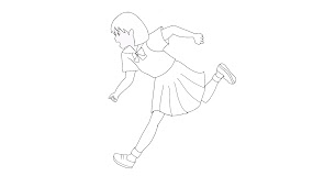
For the third pose, I drew a running pose. As shown in Fig.2.20, there are also different angle view for running poses, I drew 2 views for this pose.
.jpg)
.jpg)
Fig.2.17 Pose 3 - Running (Side and Front View)
Next, I drew a pose where in the storyline, the character falls into a hole. I drew a pose where she sat on the ground after falling into the hole. Similarly, I found references for this pose. Because of the angle, I drew a few times for this pose especially the shoes and skirt parts.
.jpg)
Fig.2.18 Pose 4 - Sitting After A Fell
The last pose for the character is where she is lying down, this part is the last part of the story. I found many different poses laying down, but they didn't quite match with what I'm thinking. So, I used different references of different poses while drawing the laying pose.
.jpg)
Fig.2.19 Pose 5 - Laying
After drawing all the poses, I started to colour them.

Expressions
Before I started, I searched for a lot of references for expressions, especially the eyes. As eyes are very expressive, I tried to study different types of eyes from Pinterest. As for this character, I found the eyes that are round, and not sharp because of her personality. I also watched different tutorials online on how to draw eyes in animation.


Fig.2.21 References - Expressions
.jpg)
Fig.2.22 Expressions Practice

Fig.2.23 Character's Eyes


Fig.2.24 References - Body Movement/Angle
.jpg)
Fig.2.25 Expressions (Drawing)
I redraw the expressions in Fig.2.25 as they are very alike with the references, I redraw them so that the expressions look more alike with my character. Then, I coloured them. The expressions shown in Fig.2.26 from left to right are happiness, sadness, shocked, surprised and frown.

Fig.2.26 Expressions (Coloured)
Final Project 1A: Character Design


Fig.2.28 Poses Sheet

Fig.2.29 Character Facial Expressions
Revised Project 1A: Character Design
.jpg)
Fig.2.30 Revised Turnaround Sheet (Week 7)

Fig.2.31 Revised Poses Sheet (Week 7)

Fig.2.32 Revised Expressions Sheet (Week 7)
Project 1B: Layout Design
For Project 1B, we are going to create a layout designs for our animated project using perspective. Our designs will be used as backgrounds for various scenes in the animation that enhance the story and the mood of the animation. We have to choose a scene from the animation and create a rough sketch of the layout design using perspective. The sketch should show the placement of the background elements and characters in the scene.
References
Before I start sketching, I found some references for my idea, which is a school background. I also searched for other references for other places of my story, like circus, school corridor and so on.


References
After searching for references, I started with sketching a school perspective background. I was unsatisfied with the result of the school perspective drawing after colouring it, so I changed my mind and sketched a circus background.

School Sketch

Circus Sketch
Colouring
After finishing the sketch, I cleaned up the sketch into drawing, so it's more easier to colour it. While colouring, I added shadows and highlights.

Circus (Coloured)
Then, I inserted the character into the background and adjust the hue, saturations of the character to match with the mood of the background.

Circus with Character
Final Project 1B: Layout Design
Final Layout Design
Final Layout Design with Character
Revised Project 1B: Layout Design

Revised Layout Design

Revised Layout Design with Character
FEEDBACKS
Week 4 / Project 1A
General Feedbacks:
Find references that are similar to your character, spot similarities in terms of their characteristics and study the character constructions (shapes & forms) and proportions. Can study Andrew Loomis' ideal proportions (human). If you do cartoon, it will have different proportions (2-3 heads). Take note of the weight and balance too, not only the proportion. Take note of the line of action too. Silhouette should look interesting. Avoid twinning. Think of some actions (running, walking, relax pose). Always remember to observe and analyse, then only you create.
Week 5 / Project 1A
Specific Feedbacks:
The character looks good, cute. But the proportions of the hand can be improved (need to be shorter), and the fingers should be longer.
Week 7 / Project 1A
General Feedbacks:
Put margin for the artboard. Side view should be flat, without angle.
Specific Feedbacks:
Can put black and white for the turnaround sheet, just put one coloured for the character at the side. Add shadows to the poses to show contact. Change frown to angry, frown is more like an action. Can squeeze the eyes more in "frown" expression.
Week 10 / Project 1B
General Feedbacks:
Keep some negative spaces, don't overlap too many things.
Specific Feedbacks:
Can put gradient on the sky, lighter on near the ground. Can put glow on the lanterns. Can put more characters at the stores.
REFLECTION
Project 1A
This project is definitely not an easy one for me. In this exercise, I think it is very important to do research and have references at the initial stage before we started to design our character. With the research and references, it allows me to understand more about how to express the character. It also helps me to complete the turnaround sheet, 5 poses and 5 expressions on time. I paid particular attention to the expressions, researching different online references to study how to draw the eyes, nose, and lips. Additionally, I explored various art styles for drawing expressions. Referring the main reference for my character, I combined its characteristics and art style with the expressions I found while drawing expressions for my character. While drawing expressions, the most challenging part is that the size of the eyes, the distance between both eyes and the proportion of the eyes, nose, lips with the face. For poses, I found that we have to observed the lines of the poses and most importantly, the angle and proportions. With references, it has been very much easier for me because without it, I can only draw from my imagination which resulting the poses to be weird (proportionally). This exercise allows me to understand how to design a character by inserting their personalities, internally or externally.
Project 1B
For me, I enjoyed doing Project 1B compared to 1A. Through this project, I did not only learn to draw perspective drawing, where I am able to design the settings or places of the storyline. In this project, I had different choices on the drawings of the perspective layout design, which are school or circus. At first, I made a few attempts on the school, but I found that colouring was the hardest part, where the coloured version of the school looks very flat, maybe because of the colour choices or shadows/highlights or the outline. Although I made a few attempts, but it does not look right, so I changed my mind to draw a circus. Similarly, I found references online and also study how they coloured the perspective drawing. In the references, they render the drawings where there are no outline. So, while drawing the circus, I seperated the drawings and colouring part unlike when I was drawing the school perspective drawing. In this project, I personally enjoyed the perspective drawing part than colouring part. And I was quite satisfied with the result of the perspective drawing of the circus.


Comments
Post a Comment