Interactive Design - Final Project: Creating a Single-Page Website for An Artist
23.10.2023 - 10.12.2023 / Week 9 - Week 16
Chan Wan Qing / 0350928 / BA of
Design (HONS) in Creative Media
Interactive Design
Final Project
INDEX:
1.
Final Project: Creating a Single-Page Website for An Artist
2.
Feedbacks
3.
Reflection
LECTURES
All lectures are recorded in Interactive Design - Exercises.
In this web design project, we are to create a single-page website for our favorite artist. This project will aims to develop our web design and development skills while allowing us to showcase our passion for the artist of our choice.
Project Requirements:
Choose our favorite artist as the subject of your website. It can be a musician, painter, actor, or any other creative individual or group. Ensure to have a genuine interest in the artist, as this will help you create a more engaging website.
Content:
- Your single-page website should include the following sections:
- Header with the artist's name and a brief tagline.
- Introduction: Provide an overview of the artist's background and why you admire them.
- Gallery: Showcase images, videos, or other multimedia related to the artist's work.
- Biography: Include a brief biography or description of the artist's life and career.
- Contact Information: If applicable, include contact details or links to the artist's social media profiles.
Project Timeline:
W10 [Sketches]
- Mood board
- Colour palette (3 colours)
*Adobe Color: RGB
- Font choice (1 - 1.5 em)
- Visual references
W11
- Low fidelity prototype (without colours - black and white)
W11 - W12
- assets (images + icons)
- folders
W12 - W13
- Start to build the website
1. References
Mood board
First of all, I did some research to create a mood board for my single-page website. I focused on the colours of blue based on my chosen artist. This can help me to hone the visual ideas at the start of the website. As there need to be 5 sections, I also searched for some visual references of website in the colours of blue and see how they use the colours.
Colour Palette
The main colour of the website will be uninavy, so I went to Adobe Color to make a colour palette surrounding the main colour with the code #00214D.
Chosen colours: #00214D #4E6380 #4977B3
Visual References
I did more research on the layouts of the website and observed how I can create different layouts through my sketches. I searched for the layouts that can be used to present an artist. I also focused on references that have different sections since we had to create a page of website with 5 sections.
I also did research on the real website for an artist and observed how they arranged the sections, contents, colours, fonts and so on.
Font Choices
2. Sketches
After I did my research, I started to sketch out the wire frames of my website. With different sketches, I drew out different layouts for the website. I included header, navigation bar, footer and also 5 different sections in my sketches. At first, I'm confused about the introduction and biography section, so in the sketches, these 2 sections are reversed.
Final Sketch
3. Low Fidelity Prototype & Prototype
After finishing with my sketch, I started to create my prototype. I created a low fidelity prototype in Adobe XD in black and white. However, I needed to create a prototype like what we did in Project 1 so that I am able to figure out that is it workable for some of the ideas.
So, I created a prototype in Adobe XD. In this prototype, I only included 1 colour as I remained the background colour as white. I only highlighted the header and footer part with navy blue.
Referring to the framework file provided by Mr Shamsul, I built another framework file because my layout is a little bit different. I included the text and images that I already organised in a folder in the HTML file in Adobe Dreamweaver.
5. CSS Codes
After completing the HTML codes, I started to write the CSS codes. I first included the link of the font I had chosen into the codes.
Header
For header, I first amended the size of the logo and set the min-height for the section. Then I use [display: flex;] to align the logo and navigation bar horizontally. I added gap between the logo and navigation bar with a suitable distance using %. Then in a different [div] for navigation bar with a class named [.navi], I added gap between each listed navigation. I also added hover effects on the navigations.
Home
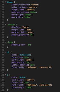
For the home section, which is the landing page that consists of 2 images, I styled the images to the centre by using [class="center"] in images in HTML code. I also added max-height and max-width of the home section. The background colour is applied under [body].
About
In the next part, which is the about part, I divided the section into 2 parts, left and right. I added gap between the 2 parts that are being display in flex. The left part is an image, and the right part is a paragraph of text. I wanted the height of the image and paragraph to be similar, so I adjusted the height of the image and also the line spacing for the text. I created 2 div for the 2 parts and apply padding under the 2 div.
Biography
For the biography part, there are a few parts where I needed to use different div to divide them and style them. Firstly, I used the div with [class="row-2"] to style the images into 3 rows (in HTML code) and 3 columns. Then, I apply different div under the 3 rows with different class and used child selector to style the text into centre.
Gallery
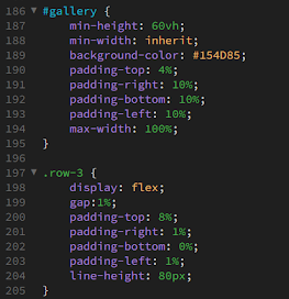
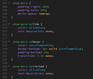
In the prototype of the gallery part, I arranged the images like collage. Initially, I was unsure about how to style them into collage, but I realised I just needed to divide the images into 3 rows like what I did in biography part. Then, I styled them by displaying them using [display; flex;]. After that, I adjusted the size of the images so that they are in the same height when they are arranged together. I also added a dumb link on the text 'SHOW MORE' and style it with CSS codes.
Contact Information
For the section of contact information, I also divided the section into 2 parts, with social media icons on the left and subscribe button on the right. I inserted the link of social media on the icons in HTML code with [a href=" "]. And for the email and submit box, I added [border-radius] to style the boxes.
Footer
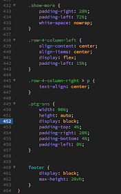
In the footer section, I included 'Copyright Information', location and phone number. For this part, I also divided into 2 parts by flex and gap. I also added [white-space: nowrap] to display the text in a single line.
Responsive
After writing the CSS coding for desktop screen size, I started to write another set of CSS code for smaller screen size. I wrote 4 sets of CSS codes for 4 different screen sizes including 996 px, 950 px, 650 px and 532 px. It was quite a challenging part for me as sometimes I don't know which code to apply to get the result I wanted. Besides, when viewing from different width, the alignments of the contents also keep on changing.
I added another screen size (415 px) after I reviewed the website on different devices from Inspect. I also changed 996 px to 1024 px.
Attempt 1
Netlify link: https://final-project-chanwanqing.netlify.app/
HTML Codes
CSS Codes
Attempt 2
I revised the website and I did some refinements. I added another section for discography and realigned the navigation bar. I also refined the home section in the 2nd attempt.
Discography
In the discography section, I added the album profile of the newest released and include some text about the album information. I divided them with different classes like discography, album and album-info.
Home
I refined the home section where I changed the image and use it as background.
Final A Single-Page Website
Netlify link: https://finalproject-chanwanqing.netlify.app/
HTML codes
CSS codes
FEEDBACKS
Week 11 / Final Project
Add background colour to make the design more interesting as prototype 1 is too dull with the plain background. Add more spaces between the paragraphs and headings. Can highlight a section with different colour or lighter colours.
REFLECTION
Through this project, I was able to gain a valuable experience and knowledge on coding as this is one of the area I am quite curious. This project allows me to apply what I have learned in this module throughout the 14 weeks. First of all, defining the structure and content of the webpage required thoughtful consideration. Therefore, research and sketches are very important in this project as it gives me a clear direction on divide the sections. The prototype also allows me to be able to look through the overall design based on the sketch and make refinements. During the process of coding, I realised the importance of HTML tags to organize information and establish a logical flow in order to create a cohesive and user-friendly interface. Styling elements, choosing color schemes, and defining layouts require us to consider carefully between creativity and technical precision. The meticulous alignment of design choices with the overall theme of the website exemplified the power of CSS in transforming a basic HTML structure into an engaging and visually appealing web page. Ensuring the responsiveness across different devices and browsers is the most challenging part for me in the whole project and this allows me to understand the importance of writing clean and efficient code. Despite the challenges, it was really satisfied to see the webpage come to life, responsive and aesthetically pleasing.


.png)
.png)


Comments
Post a Comment